Featured Articles
- 9 Surprising Psychological Triggers Hidden in Beautiful Web Design That Captivate Visitors Instantly
- Exploring the Art of Balance: Minimalism vs. Maximalism in Beautiful Web Design Unleashed
- From Chaos to Calm: Exploring the Allure of Randomized Layouts in Beautiful Web Design
- Reviving Retro: How Nostalgic Design Elements Are Transforming Modern Web Aesthetics
- The Aesthetics of Code: How Beautiful Web Design Can Influence Emotional User Experiences
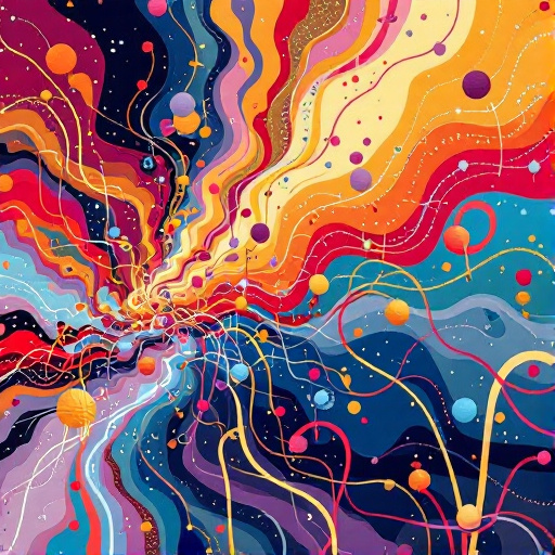
9 Surprising Psychological Triggers Hidden in Beautiful Web Design That Captivate Visitors Instantly
9 Surprising Psychological Triggers Hidden in Beautiful Web Design That Captivate Visitors Instantly
9 Surprising Psychological Triggers Hidden in Beautiful Web Design That Captivate Visitors Instantly
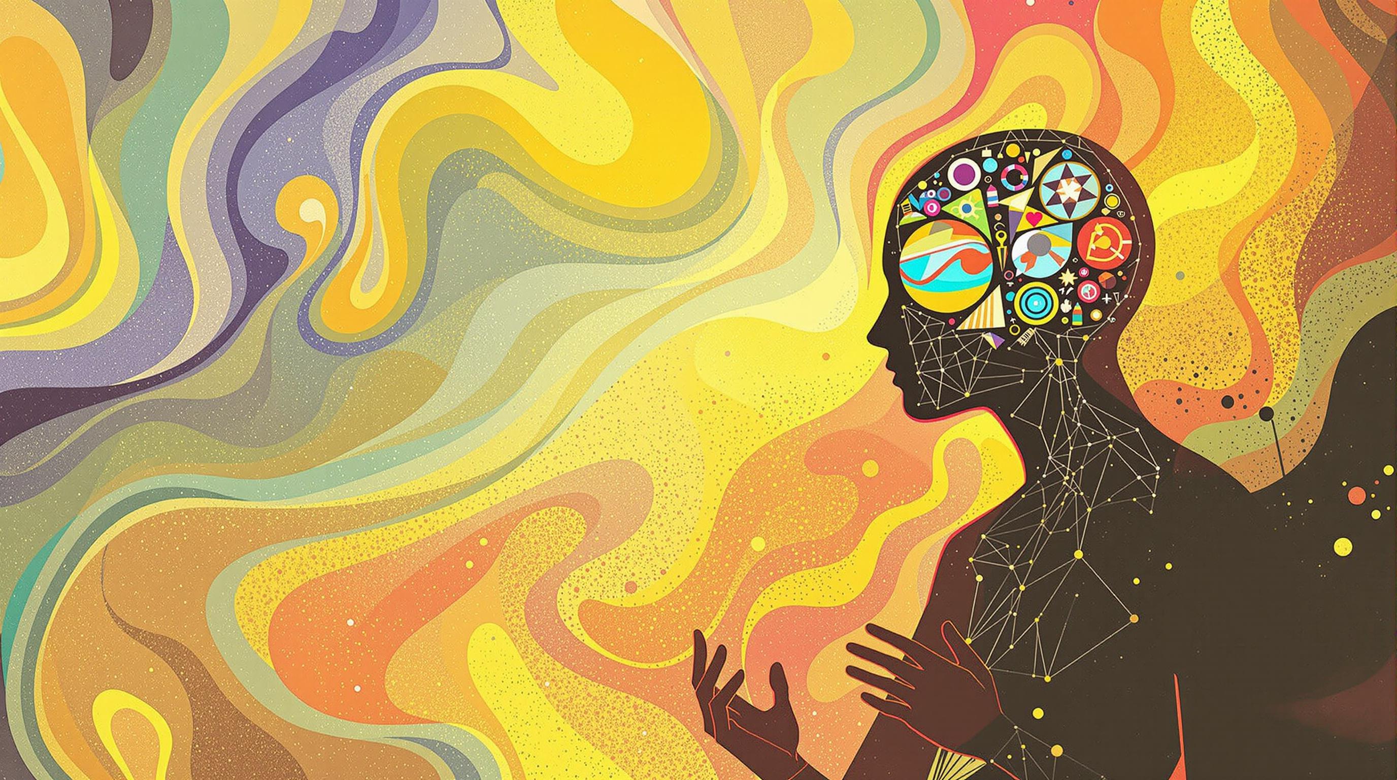
In today’s digital world, web design is far more than just aesthetics. It plays a crucial role in influencing visitor behavior and engagement. Behind the beautiful visuals lie psychological triggers that subtly guide users' emotions and decisions. By understanding these triggers, designers can create websites that not only attract but also captivate and convert visitors. This article explores nine surprising psychological elements integrated into web design that make users stay, interact, and return.
Whether you are a designer, marketer, or business owner, recognizing these hidden cues can elevate your website’s effectiveness significantly. Let's delve into these psychological triggers and uncover the science behind visually compelling web experiences.
1. Color Psychology: More Than Just Pretty Palettes
Colors evoke emotions and can influence moods in powerful ways. For example, blue often conveys trust and security, which is why many financial and tech companies use it. Red, on the other hand, signifies urgency or excitement and can encourage quick action, a common tactic in sales-focused websites.
Designers carefully choose color schemes not only for beauty but to subconsciously affect how visitors feel about the brand or product. According to a study published in the journal Behavior & Information Technology, up to 90% of snap judgments made about products can be based on color alone (Singh, 2006).
By leveraging color psychology, websites can create a mood that matches their message and nudges visitors toward desired behaviors like signing up, purchasing, or exploring further.
2. Visual Hierarchy: Guiding the Eyes Effortlessly
Visual hierarchy involves arranging elements so that visitors naturally focus on the most important parts first. Size, contrast, and spacing help create this flow. For instance, a large, bold headline captures attention immediately, followed by smaller descriptions or calls to action.
When done effectively, visual hierarchy reduces cognitive load, making the site easier to navigate and understand. This comfort keeps visitors on the page longer, enhancing engagement and conversion rates.
Research from the Nielsen Norman Group highlights how users scan pages in an F-shaped pattern, so placing key information along this path can significantly improve retention and actions.
3. Consistency Creates Comfort and Trust
Consistent use of fonts, colors, button styles, and layouts creates a unified experience that feels trustworthy and professional. Inconsistent design can confuse visitors and disrupt their journey, leading to higher bounce rates.
Psychologically, consistency mirrors predictability, which humans crave as it reduces uncertainty. Familiar patterns encourage visitors to explore, knowing exactly what to expect next.
Studies in cognitive psychology suggest that when environments feel predictable, people experience less stress and are more likely to engage deeply (Bar-Eli et al., 2007).
4. White Space: The Power of Nothingness
Also called negative space, white space is the empty area around elements. While it might seem counterintuitive, white space can increase comprehension and focus by preventing information overload.
By providing breathing room, white space helps visitors process content better and makes important elements stand out. It also conveys sophistication and clarity, enhancing the overall user experience.
The use of white space has been shown to increase reader attention by up to 20%, according to a study by Wichita State University.
5. Social Proof: The Invisible Persuader
Display of testimonials, user reviews, and trust badges leverages social proof psychology. Seeing others endorse a product or service reduces uncertainty and builds trust instantly.
Humans are social creatures, and we tend to follow the actions of others, especially in ambiguous situations. Featuring real feedback and user counts can significantly improve visitor confidence and conversions.
According to BrightLocal's Consumer Review Survey, 79% of consumers trust online reviews as much as personal recommendations.
6. Speed and Feedback: Keeping Visitors in Control
Fast loading times and immediate visual feedback on interactions (like button presses) create a sense of control and responsiveness. Slow or unreactive websites generate frustration, causing users to leave.
Psychological studies link delays to anxiety and decreased satisfaction. Hence, providing instant visual cues reassures visitors that their actions were registered.
The Stanford Persuasive Technology Lab found that as page load time goes from one to ten seconds, the probability of a visitor bouncing increases by 123%.
7. Storytelling Through Imagery
Images and graphics that tell a story engage the visitor’s imagination and emotions more than plain text. Visual narratives help form connections and make content memorable.
When visitors relate emotionally to images, they perceive the brand as authentic and relatable. This emotional pull can be the difference between a fleeting glance and a lasting impression.
Neurological research shows that storytelling activates multiple brain areas, making messages more impactful and easier to recall (Zak, 2014).
8. Cognitive Fluency: Design Simplicity Aids Decision-Making
Cognitive fluency refers to the ease with which information is processed. Simple, clear design increases fluency, making visitors more likely to trust the site and take action.
Complex layouts or jargon-heavy content can create confusion and hesitation, causing users to abandon their journey.
Research published in the Journal of Consumer Psychology demonstrates that easier-to-process stimuli lead to more positive judgments and higher likelihood of purchase.
9. Scarcity and Urgency: The Art of Subtle Pressure
Design elements such as countdown timers, limited stock indicators, or exclusive offers exploit the psychological trigger of scarcity. This creates a fear of missing out (FOMO) that motivates immediate action.
When used sparingly and honestly, scarcity signals push visitors from contemplation to conversion. Overuse, however, can lead to distrust.
Studies in behavioral economics show scarcity effects can increase perceived value and urgency, heightening user engagement (Cialdini, 2009).
In conclusion, beautiful web design is much more than pleasing visuals; it strategically weaves psychological triggers to captivate and convert visitors. Understanding these hidden cues equips creators to build websites that resonate emotionally and cognitively with their audience, fostering deeper connections and better results.
Sources:
- Singh, S. (2006). Impact of color on marketing. Management Decision.
- Bar-Eli, M., et al. (2007). Uncertainty Reduction through Consistency.
- Wichita State University study on white space.
- BrightLocal Consumer Review Survey.
- Stanford Persuasive Technology Lab research.
- Zak, P. (2014). Why Your Brain Loves Good Storytelling.
- Journal of Consumer Psychology on cognitive fluency.
- Cialdini, R. (2009). Influence: The Psychology of Persuasion.
Related Articles